pbmc <- subset(pbmc, subset = nFeature_RNA > 200 & nFeature_RNA < 2500 & percent.mt < 5)3. QC
Install Seurat
Seurat (Hao, et al., Nature Biotechnology 2023) is an R package designed for QC, analysis, and exploration of single-cell RNA-seq data. Seurat aims to enable users to identify and interpret sources of heterogeneity from single-cell transcriptomic measurements, and to integrate diverse types of single-cell data.
Head to the Seurat website and install Seurat and SeuratData in RStudio.
In addition you will need to install dplyr and patchwork packages
We will now follow the Seurat tutorial on the analysis of Peripheral Blood Mononuclear Cells (PBMC) a dataset freely available from 10X Genomics.
Find this tutorial on the Seurat website
Setup the Seurat Object
Why do we need a sparse-matrix representation of the genes (\(M\)) x cells (\(N\)) matrix \(X^{N \times M}\) ?
In their 2020 paper, Choi et al. investigate the high proportion of zeros in scRNA-Seq data.
The following figure is typical of droplet based scRNA-Seq. 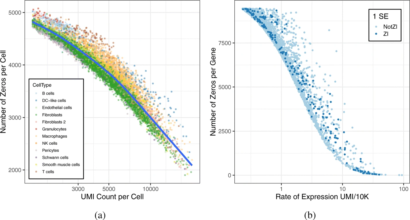
ZI stand for zero-inflated model a mixture between a count model and a density mass in zero.
Can you think of some explanation for the presence of so many UMI counts equal to zero ?
QC and selecting cells for further analysis
Give a definition of:
- Low-quality cells or empty droplets
- Cell doublets or multiplets
Dead of dying cells can be characterized by a high percentage of mitochondrial RNA in a scRNAseq droplets.
From a statistical point of view give a critic of the following command:
If you want you can download the raw pbmc3k data from here. To produce the following plot, called a knee-plot.
library(tidyverse)
library(Seurat)

system("curl -O https://cf.10xgenomics.com/samples/cell-exp/1.1.0/pbmc3k/pbmc3k_raw_gene_bc_matrices.tar.gz")
system("tar -xvf pbmc3k_raw_gene_bc_matrices.tar.gz")

pbmc.data.raw <- Read10X(data.dir = "raw_gene_bc_matrices/hg19/")
pbmc.raw <- CreateSeuratObject(counts = pbmc.data.raw, project = "pbmc3k", min.cells = 0, min.features = 0)

tibble(
  nCount = pbmc.raw$nCount_RNA,
  rank = rank(pbmc.raw$nCount_RNA)
) %>%
  ggplot(aes(x = rank, y = nCount)) +
  geom_line() +
  scale_x_log10() +
  scale_y_log10() +
  theme_bw()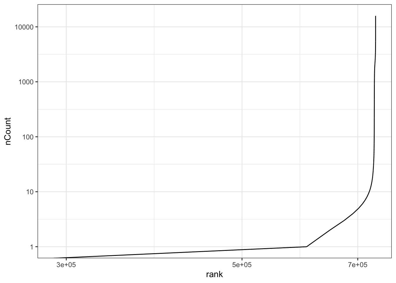
Plotting the rank of a variable is similar to visualizing the empirical cumulative distribution of this variable (\(ecdf = \frac{rank}{max(rank)}\)). What can you say about this plot ?
Head to the next section where you will learn how to normalize your data.