if (!require("BiocManager", quietly = TRUE))
  install.packages("BiocManager")
if (!require("SingleCellExperiment", quietly = TRUE))
  BiocManager::install("SingleCellExperiment")
library(SingleCellExperiment)scRNA-seq: Nature of the data
scRNA-Seq data
UMI
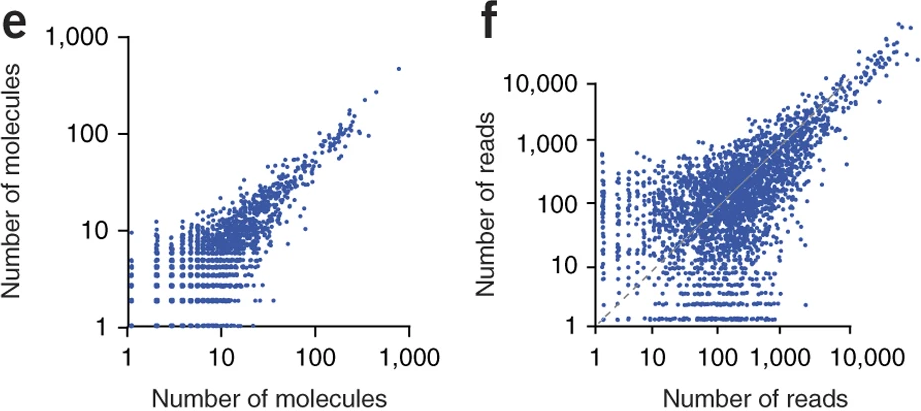
Typical droplet scRNA-seq experiments utilize UMI counts to quantify gene expression in single cell. UMI or Unique Molecular Identifiers are small barcode that are linked to the 3’ end of mRNA molecules before any amplification step (Islam et al. 2013). This technique allows us to easily remove PCR amplification bias from the data.
From the two following figures the figure e or the figure f, which one is representing UMI count data ?
3’ sequencing
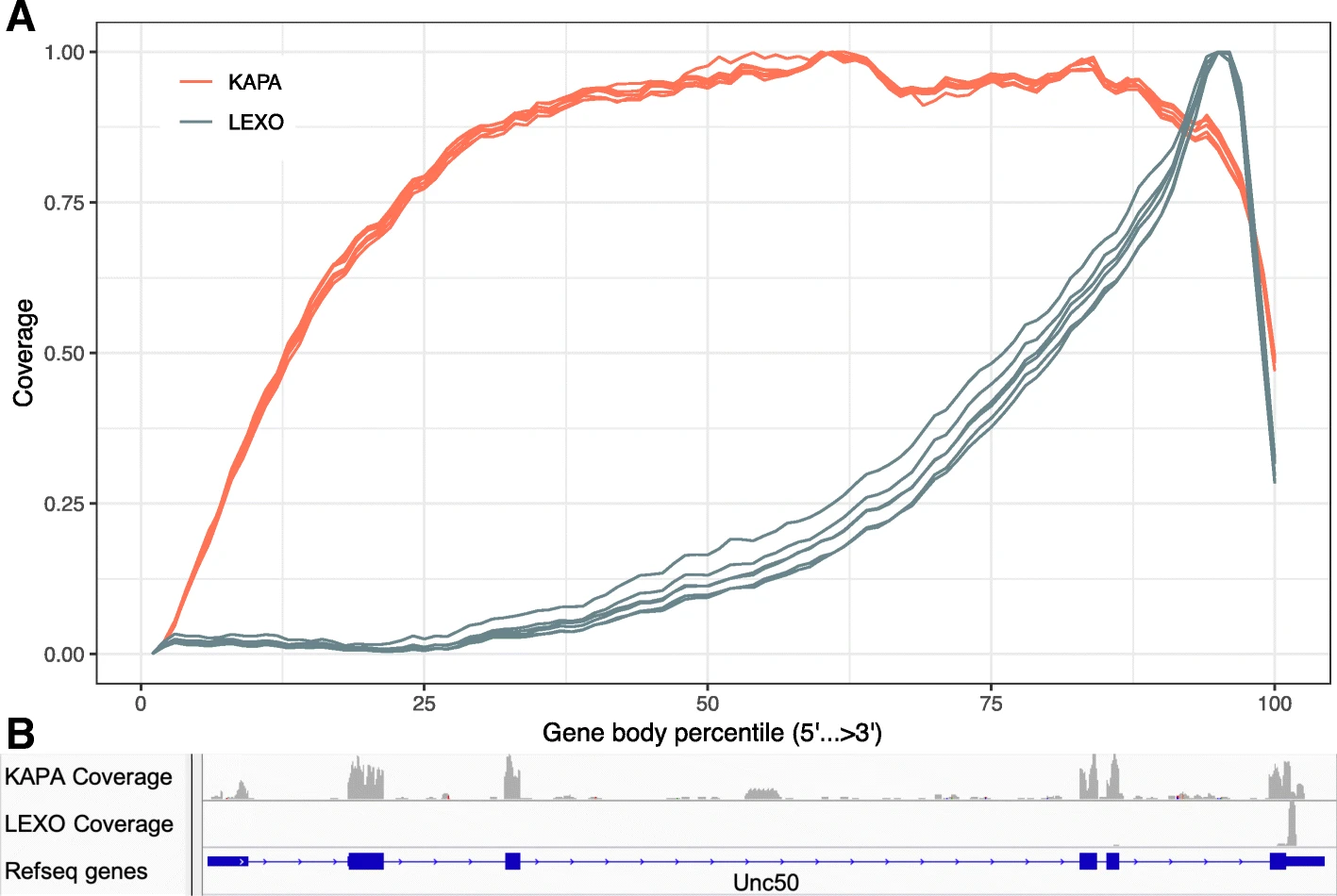
Moreover current typical droplet scRNA-seq experiments rely on 3’ sequencing which means that we don’t have a uniform read distribution along the mRNA molecule sequence. The Feiyang Ma et al. 2010 paper compares a 3’ sequencing method to a classical sequencing method.
Without reading the paper, and from the following figure: which method between KABA or LEXO is the 3’ sequencing one ?
mRNA synthesis
To understand the nature of the data that we are going to analyze, it’s important to understand the mechanisms that generate the observed data. The Breda et al. 2021 paper summarizes these processes in the Figure 1 of their paper.

Cartoons of the flow of causality from the physical state of the cell to gene expression patterns. The concentrations of transcription factors (TFs), chromatin modifiers and other regulatory factors determine changes in chromatin state, three-dimensional (3D) organization of the chromosomes, binding and unbinding of TFs to promoters and enhancers, and so on. These determine the time-dependent rate \(\lambda_g(t)\) at which gene \(g\) was described a time \(t\) in the past. Similarly, the concentrations of microRNAs, RNases and other RNA-binding proteins determine the time-dependent rate \(\mu_g(t)\) at which mRNAs of gene \(g\) decayed at time \(t\) in the past.

The transcription activity \(a_g\) of gene \(g\) is defined as the expected number of mRNAs and is a weighted average of its transcription and decay rates in the past. We define the expression state of the cell as the vector \(\vec{\alpha}\) of relative transcription activities of all genes.

Logical flow from expression state \(\vec{\alpha}_c\) to observed UMI counts \(\vec{n}_c\). The expression state \(\vec{\alpha}_c\) and total transcription activity \(A_c\) determine the transcription activities \(a_{gc}\). For each gene \(g\), the probability \(P(m_{gc}∣a_{gc})\) of having \(m_{gc}\) mRNAs is a Poisson distribution with mean \(a_{gc}\). Assuming each mRNA in cell \(c\) has a probability \(p_c\) of being captured and sequenced, the probability \(P(n_{gc}∣p_c, a_{gc})\) of obtaining \(n_{gc}\) UMIs is a Poisson distribution with mean \(p_{c}a_{gc}\).

The probability of obtaining the UMI counts \(\vec{n}_c\) given the cell state \(\vec{\alpha}_c\) is a product over genes of Poisson distributions with means \(N_c\alpha_{gc}\), where \(N_c\) is the total UMI count in cell \(c\).
Zeros
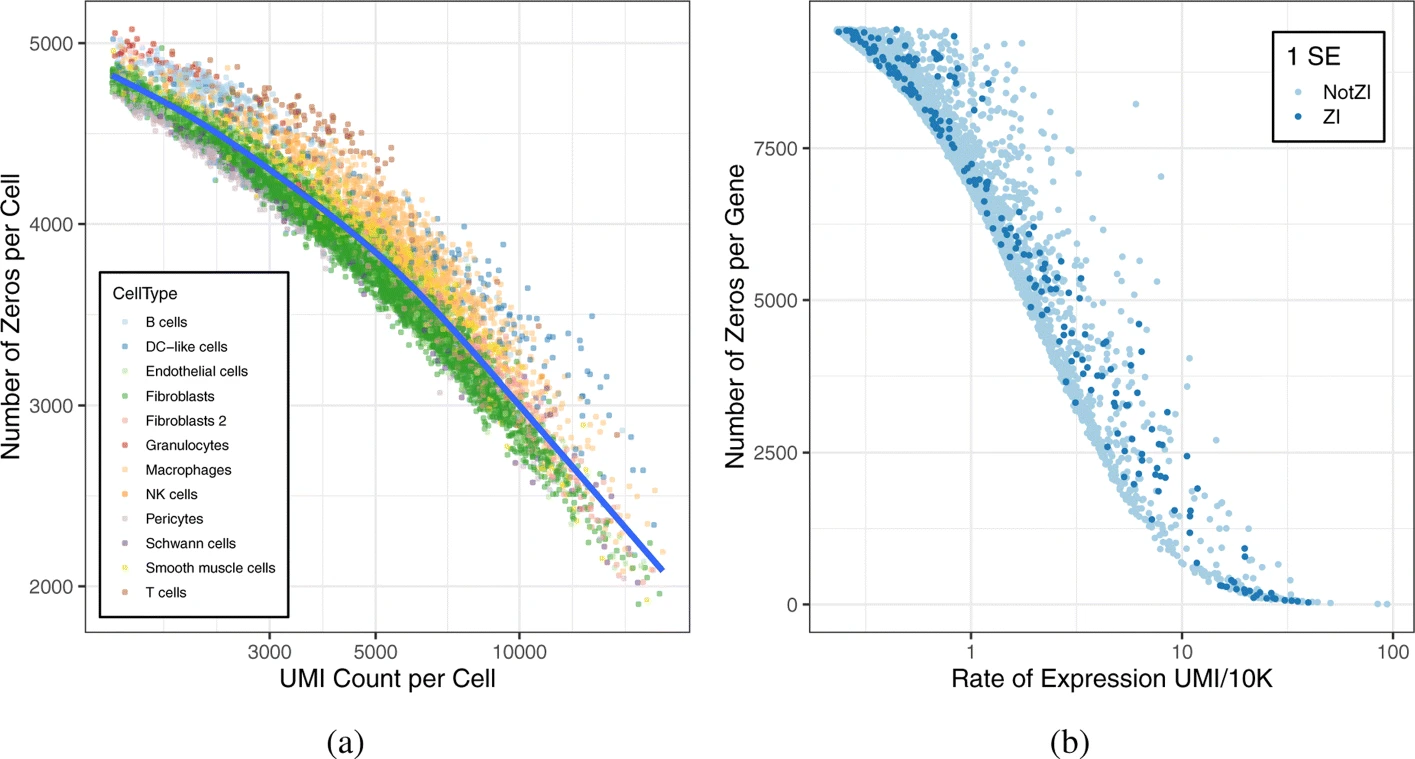
In their 2020 paper, Choi et al. investigate the high proportion of zeros in scRNA-Seq data.
The following figure is typical of droplet based scRNA-Seq. Can you think of some explanation for the presence of so many UMI counts equal to zero ?
exploring scRNA-seq data
Single-cell experiment
Before, starting to work with scRNA data, we need a data structure to store these data.
To store and manipulate our data in R, we are going to use the SingleCellExperiment class (from the SingleCellExperiment package). This class implements a data structure that stores all aspects of our single-cell data: gene-by-cell expression data, per-cell metadata and per-gene annotation and manipulate them in a synchronized manner.
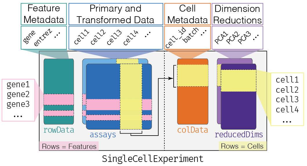
This object is used by most of the single-cell package on Bioconductor. The other principal R format used by the Seurate tools suite follows the same kind of format with a count matrix and gene and cell annotation table. In Python the AnnData object has also the same structure, and conversion tools exist to pass from one format to another.
Fake everywhere
As you are future bioinformaticians, we are going to start by working with the best data there is for you: simulated data. For that we will use the Splatter R package that simulates scRNA-Seq data set.
But first we are going to need some libraries:
if (!require("splatter", quietly = TRUE))
  BiocManager::install("splatter")
if (!require("scater", quietly = TRUE))
  BiocManager::install("scater")
if (!require("Seurat", quietly = TRUE))
  install.packages('Seurat')
if (!require("codetools", quietly = TRUE))
  install.packages('codetools')
library(codetools)
library(splatter)
library(scater)
library(Seurat)
library(tidyverse)
simulation parameters
First we need to set the simulation parameters
params <- newSplatParams()Visualize these parameters (you can use the function
str())
The Figure 1 from the Splatter paper explains the simulation parameters and their functions in the data generation process with a DAG from the top to the bottom of the figure.
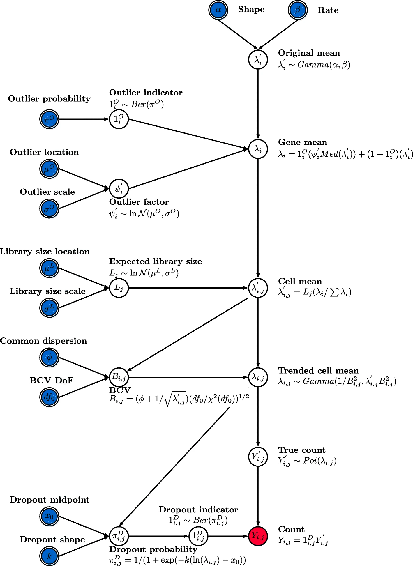
We are going to investigate these simulation parameters during the practical.
The Splat simulation uses a hierarchical probabilistic where different aspects of a dataset are generated from appropriate statistical distributions. The first stage generates a means expression level for each gene. These are originally chosen from a Gamma distribution.
First let see the effect of alpha or shape (mean.shape parameter) and beta or rate (mean.rate parameter) on the Gamma distribution density
tibble(
  alpha = seq(from = 1, to = 10, length.out = 5)
) %>%
  mutate(
    beta = list(seq(from = 0.1, to = 0.9, length.out = 5))
  ) %>%
  unnest(beta) %>%
  mutate(
    lambda = map2(alpha, beta, function(x, y){
      rgamma(n = 1000, shape = x, rate = y)
    })
  ) %>%
  unnest(lambda) %>%
  ggplot(aes(x = lambda)) +
  geom_histogram(binwidth = 1) +
  facet_wrap(~alpha + beta, scales = "free", labeller = label_both) +
  theme_classic()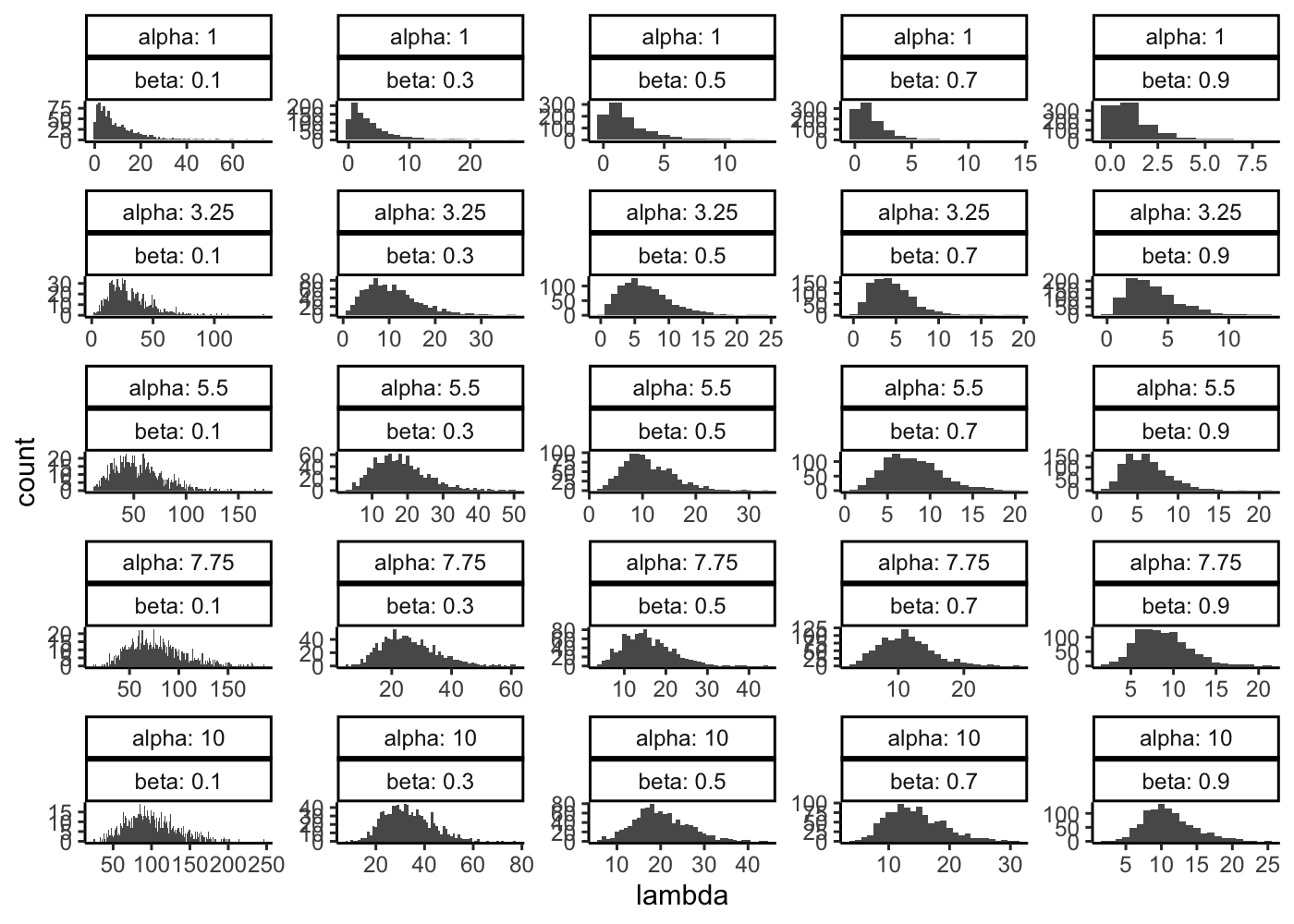
Then let see the effect of the shape and rate parameter on the Gamma-Poisson distribution density.
tibble(
  alpha = seq(from = 1, to = 10, length.out = 5)
) %>%
  mutate(
    beta = list(seq(from = 0.1, to = 0.9, length.out = 5))
  ) %>%
  unnest(beta) %>%
  mutate(
    count = map2(alpha, beta, function(x, y){
     rgamma(n = 1000, shape = x, rate = y) %>%
      map_dbl(function(x){rpois(n = 1, lambda = x)})
    })
  ) %>%
  unnest(count) %>%
  ggplot(aes(x = count)) +
  geom_histogram(binwidth = 1) +
  facet_wrap(~alpha + beta, scales = "free", labeller = label_both) +
  theme_classic()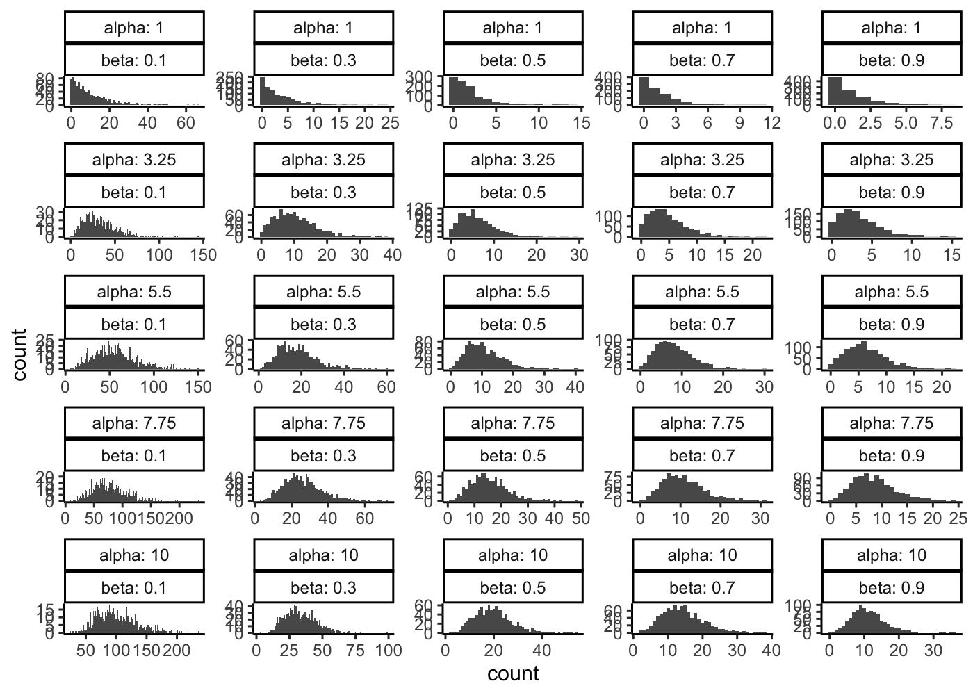
Why do you think that a Gamma-Poisson is more realistic than a Poisson distribution for a given gene and a homogeneous population of cells ?
Do you know another distribution name that can correspond to this kind of data ?
To better understand what we are doing we are going to first work with 2000 gene and 1000 cells:
params <- setParam(params, "nGenes", 2000)
params <- setParam(params, "batchCells", 1000)
For some genes that are selected to be outliers with high expression, a factor is generated from a log-normal distribution. These factors are then multiplied by the median gene mean to create new means for those genes.
# Few outliers
sim1 <- splatSimulate(out.prob = 0.001, verbose = FALSE)
ggplot(as.data.frame(rowData(sim1)),
     aes(x = log10(GeneMean), fill = OutlierFactor != 1)) +
  geom_histogram(bins = 100) +
  ggtitle("Few outliers") +
  theme_classic()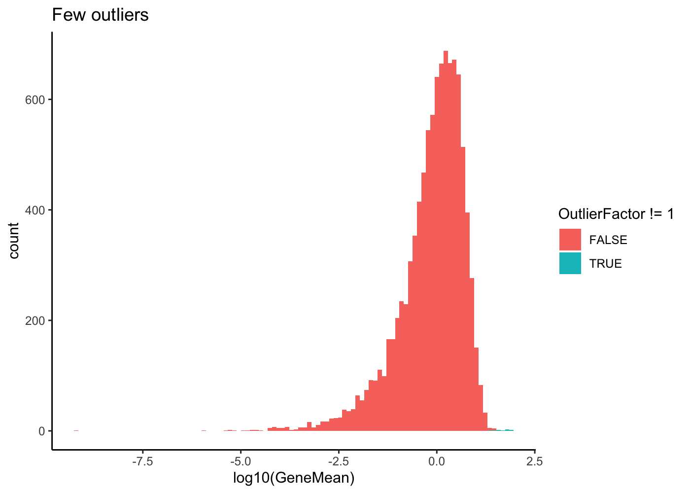
# Lots of outliers
sim2 <- splatSimulate(out.prob = 0.2, verbose = FALSE)
ggplot(as.data.frame(rowData(sim2)),
     aes(x = log10(GeneMean), fill = OutlierFactor != 1)) +
  geom_histogram(bins = 100) +
  ggtitle("Lots of outliers") +
  theme_classic()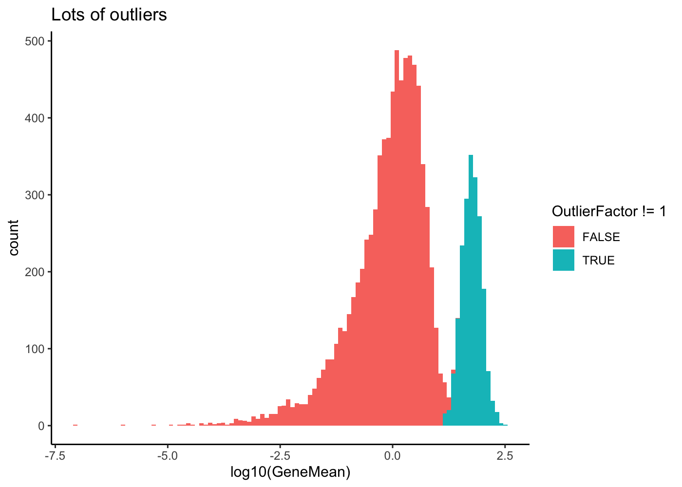
The library sizes are then used to scale the gene means for each cell, resulting in a range a counts per cell in the simulated dataset. The gene means are then further adjusted to enforce a relationship between the mean expression level and the variability.
What is a library in scRNA-Seq compared to bulk RNA-Seq ?
The lib.loc, lib.scale define the mean and standard deviation of the logNormal distribution from which is drawn the library size factor.
The final cell by gene matrix of genes means is then used to generate a count matrix using a Poisson distribution. The result is a synthetic dataset consisting of counts from a Gamma-Poisson (or negative-binomial) distribution. An additional optional step can be used to replicate a “dropout” effect. A probability of dropout is generated using a logistic function based on the underlying mean expression level. A Bernoulli distribution is then used to create a dropout matrix which sets some of the generated counts to zero.
params <- setParam(params, "dropout.type", "none")The model described here will generate a single population of cells but the Splat simulation has been designed to be as flexible as possible and can create scenarios including multiple groups of cells (cell types), continuous paths between cell types and multiple experimental batches. The parameters used to create these types of simulations and how they interact with the model are described below. We then remove the batch effect
sim <- splatSimulate(params)Use the
rowData()andcolData()function to explore the additional data stored in thesceexperiment bysplatter
rowData(sim)DataFrame with 2000 rows and 4 columns
Gene BaseGeneMean OutlierFactor GeneMean
<character> <numeric> <numeric> <numeric>
Gene1 Gene1 0.0444407 1 0.0444407
Gene2 Gene2 3.9105183 1 3.9105183
Gene3 Gene3 1.3600595 1 1.3600595
Gene4 Gene4 0.0542209 1 0.0542209
Gene5 Gene5 1.4658495 1 1.4658495
... ... ... ... ...
Gene1996 Gene1996 2.73647490 1.0000 2.736475
Gene1997 Gene1997 0.00443509 36.9241 38.956794
Gene1998 Gene1998 0.27549683 1.0000 0.275497
Gene1999 Gene1999 0.12566697 1.0000 0.125667
Gene2000 Gene2000 5.87329244 1.0000 5.873292colData(sim)DataFrame with 1000 rows and 3 columns
Cell Batch ExpLibSize
<character> <character> <numeric>
Cell1 Cell1 Batch1 67344.7
Cell2 Cell2 Batch1 48322.6
Cell3 Cell3 Batch1 41903.4
Cell4 Cell4 Batch1 59501.7
Cell5 Cell5 Batch1 54937.0
... ... ... ...
Cell996 Cell996 Batch1 56350.5
Cell997 Cell997 Batch1 79356.5
Cell998 Cell998 Batch1 75495.8
Cell999 Cell999 Batch1 58499.0
Cell1000 Cell1000 Batch1 49131.6Data visualization
We can use scater to visualize the sim data
# PCA plot using scater
sim <- logNormCounts(sim) # add log1p assay
sim <- runPCA(sim) # add PCA results in the dimension reduction tables
plotPCA(sim, colour_by = "Batch")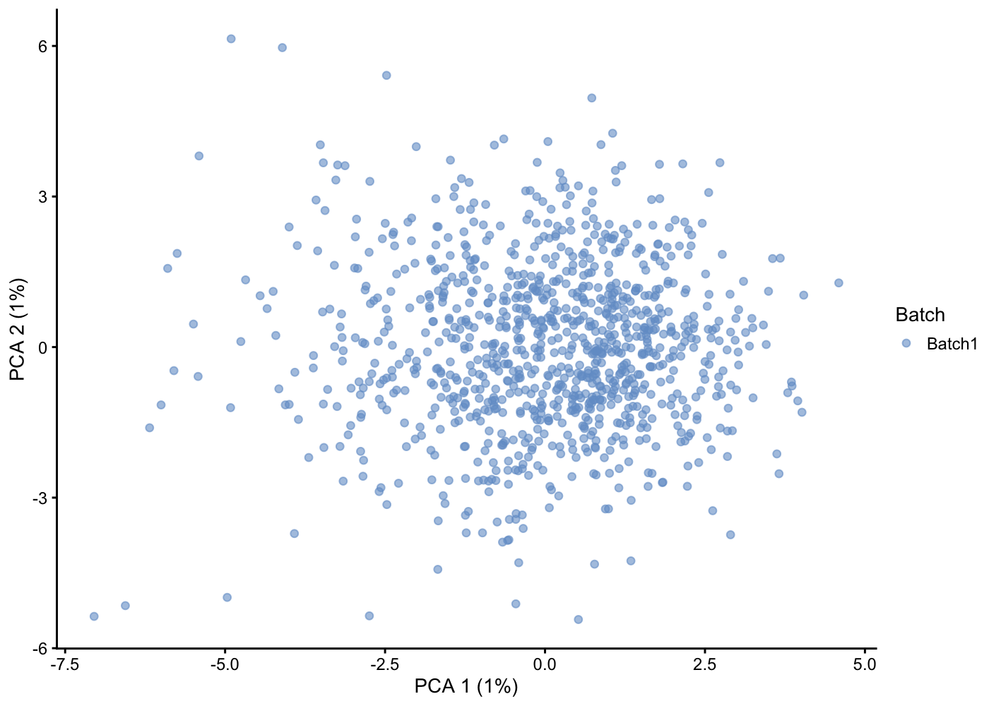
Zeros plots
Try to reproduce the 1.4 Zeros plot using the
counts()function
We add the zero_n annotation to the sce object:
rowData(sim)["zero_n"] <- rowSums(counts(sim) == 0)
rowData(sim)["sum_gene"] <- rowSums(counts(sim))
colData(sim)["zero_n"] <- colSums(counts(sim) == 0)
colData(sim)["sum_cell"] <- colSums(counts(sim))colData(sim) %>%
as_tibble() %>%
ggplot(aes(x = sum_cell, y = zero_n)) +
geom_point() +
scale_x_log10() +
theme_classic()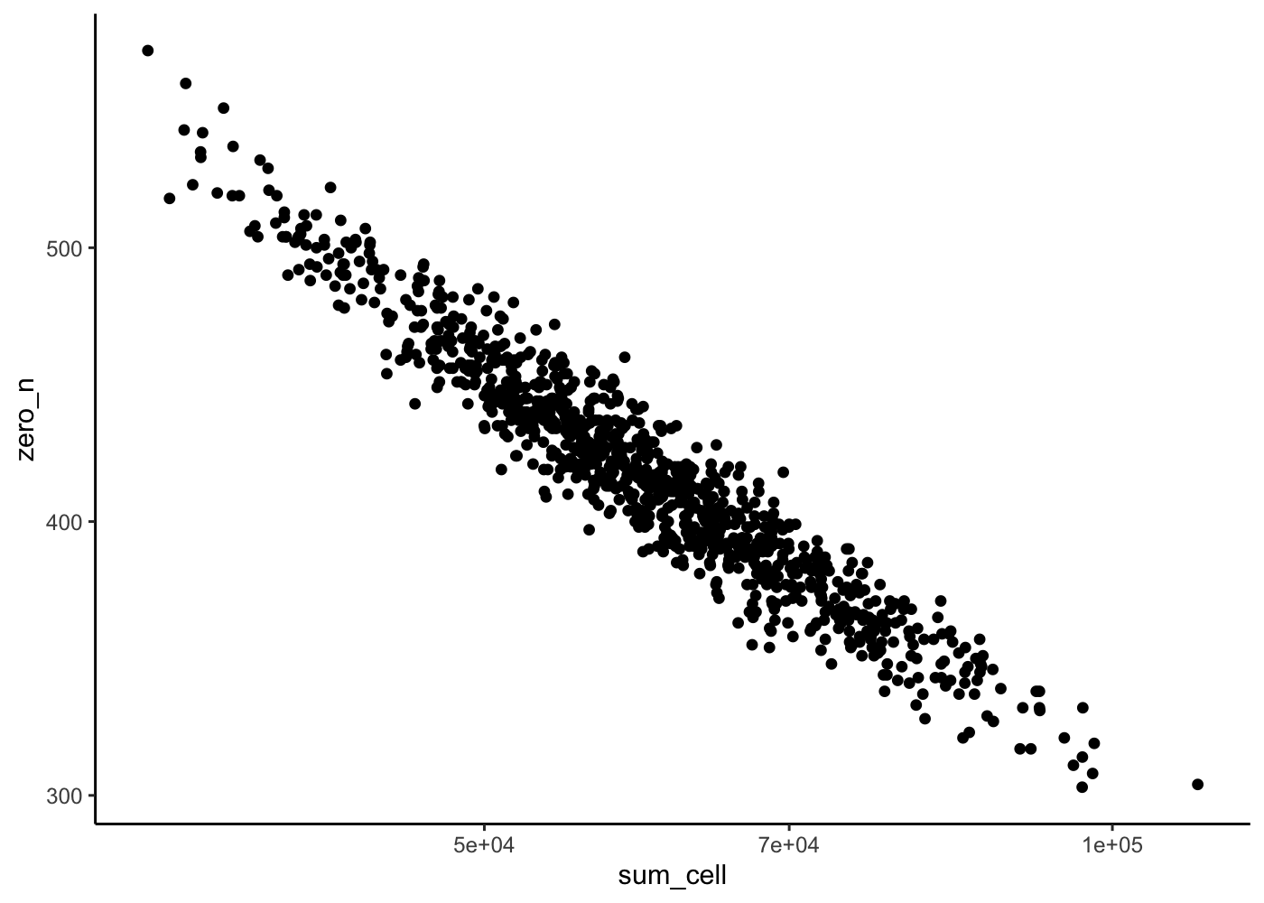
rowData(sim) %>%
as_tibble() %>%
ggplot(aes(x = sum_gene/10e3, y = zero_n)) +
geom_point() +
scale_x_log10() +
theme_classic()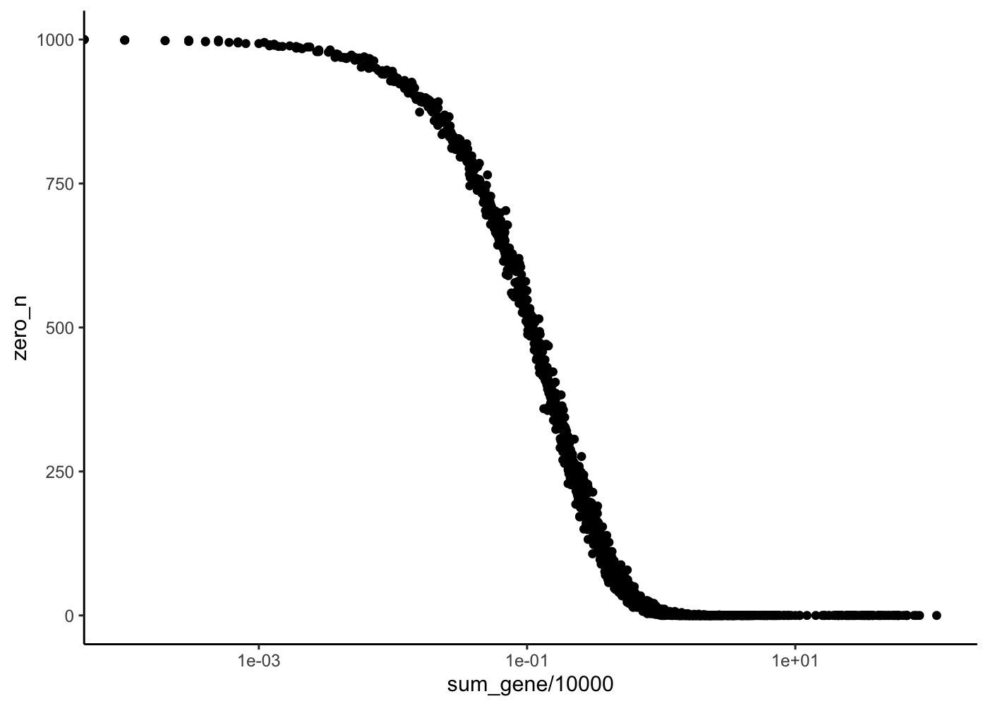
Realistic simulation
To simulate data that look more like real one, we can use the parameters of a real dataset. We start by downloading the following 10X genomics dataset:
In the terminal get the data set:
curl -O https://s3-us-west-2.amazonaws.com/10x.files/samples/cell/pbmc3k/pbmc3k_filtered_gene_bc_matrices.tar.gz
tar -xvf pbmc3k_filtered_gene_bc_matrices.tar.gz % Total % Received % Xferd Average Speed Time Time Time Current
Dload Upload Total Spent Left Speed
0 0 0 0 0 0 0 0 --:--:-- --:--:-- --:--:-- 0
0 0 0 0 0 0 0 0 --:--:-- --:--:-- --:--:-- 0
0 7443k 0 68064 0 0 55510 0 0:02:17 0:00:01 0:02:16 55653
39 7443k 39 2939k 0 0 1292k 0 0:00:05 0:00:02 0:00:03 1293k
100 7443k 100 7443k 0 0 2436k 0 0:00:03 0:00:03 --:--:-- 2440k
x filtered_gene_bc_matrices/
x filtered_gene_bc_matrices/hg19/
x filtered_gene_bc_matrices/hg19/matrix.mtx
x filtered_gene_bc_matrices/hg19/genes.tsv
x filtered_gene_bc_matrices/hg19/barcodes.tsvWe then use this data set to create an sce object. We are going to use this sce object to estimate geologically relevant parameters for our simulated data.
sce <- SingleCellExperiment(
Seurat::Read10X(data.dir = "filtered_gene_bc_matrices/hg19/")
)
params_real <- assay(sce) %>%
as.matrix() %>%
t() %>%
as.data.frame() %>%
sample_n(100) %>% # subsample cell to be faster
t() %>%
splatter::splatEstimate()We can then simulate our data
sim <- splatSimulate(params_real, nGenes = 2000, batchCells = 1000, verbose = F)Is the cells plot more realistic ?
rowData(sim)["zero_n"] <- rowSums(counts(sim) == 0)
rowData(sim)["sum_gene"] <- rowSums(counts(sim))
colData(sim)["zero_n"] <- colSums(counts(sim) == 0)
colData(sim)["sum_cell"] <- colSums(counts(sim))
colData(sim) %>%
  as_tibble() %>%
  ggplot(aes(x = sum_cell, y = zero_n)) +
  geom_point() +
  scale_x_log10() +
  theme_classic()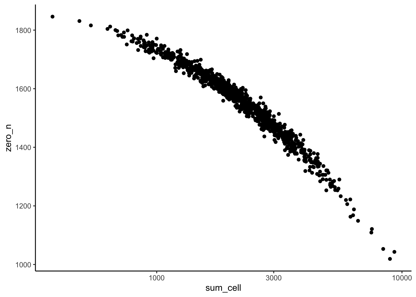
Coefficient of Variation plot
Finally let’s check the mean versus CV variation
rowData(sim)["mean"] <- rowMeans(counts(sim))
rowData(sim)["var"] <- rowVars(counts(sim))
rowData(sim)["CV"] <- rowData(sim)["var"][, 1] / rowData(sim)["mean"][, 1]

rowData(sim) %>%
  as_tibble() %>%
  ggplot(aes(x = mean, y = CV)) +
  geom_point() +
  scale_x_log10() +
  geom_hline(yintercept = 1, color = "red") +
  theme_classic()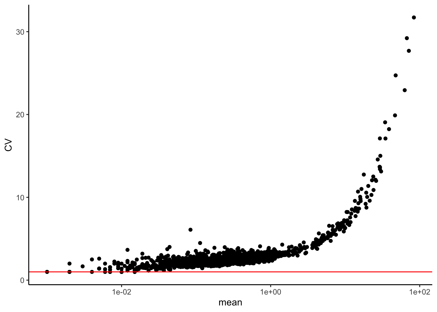
rowData(sim) %>%
  as_tibble() %>%
  ggplot(aes(x = mean, y = var)) +
  geom_point() +
  scale_y_log10() +
  scale_x_log10() +
  geom_abline(yintercept = 0, slop = 1, color = "red") +
  theme_classic()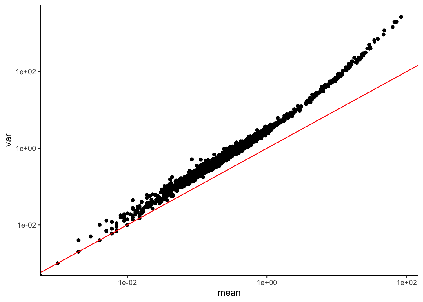
What can you tell about this relation ? What is the link with the Gamma-Poisson model ?
Groups of cells
In real data set, we often have different cell types in a data set. In a classical analysis, you are going to have to identify these groups (clustering) and do various analyses between these groups (differential expression analysis, etc.).
We can use splatter to simulate groups.
The splatSimulateGroups() function can take the following parameters:
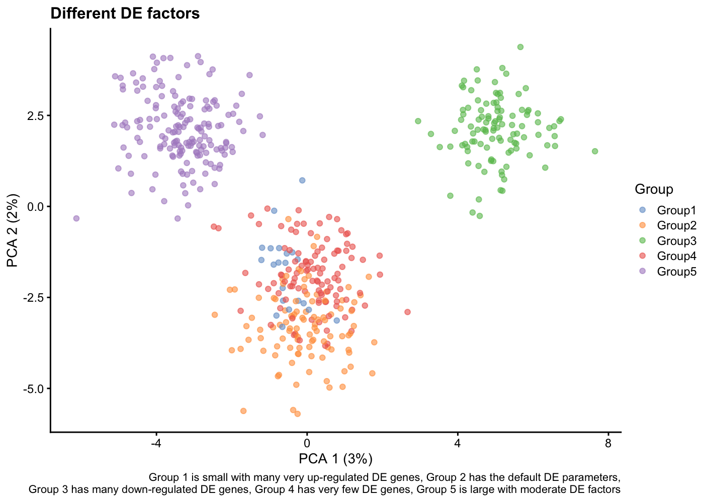
group.probis a vector of group proportion that sum to 1de.probis the proportion of differentially expressed genes in each groupde.downProbis the proportion of down-regulated genes in each groupde.facLocis the location value for each groupde.facSacleis the scale value for each group
Try to change the
splatSimulateGroups()parameters to see their effect on the PCA representation
sim <- splatSimulateGroups(params,
                            batchCells = 500,
                            nGenes = 1000,
                            group.prob = c(0.05, 0.2, 0.2, 0.2, 0.35),
                            de.prob = c(0.3, 0.1, 0.2, 0.01, 0.1),
                            de.downProb = c(0.1, 0.4, 0.9, 0.6, 0.5),
                            verbose = FALSE)
sim <- logNormCounts(sim)
sim <- runPCA(sim)
plotPCA(sim, colour_by = "Group") +
    labs(title = "Different DE factors",
         caption = paste(
             "Group 1 is small with many very up-regulated DE genes,",
             "Group 2 has the default DE parameters,\n",
             "Group 3 has many down-regulated DE genes,",
             "Group 4 has very few DE genes,",
             "Group 5 is large with moderate DE factors")
         )
Paths of cells
Sometime, in scRNA-Seq instead of having discreet cell-type we observe a continuous path of cell state. This is the case for cell differentiation, for example.
We can use splatter to simulate paths.
The splatSimulateGroups() function can take the following parameters:
path.fromis a vector of the group order (stating from zero)
sim <- splatSimulatePaths(params,
                            batchCells = 500,
                            nGenes = 1000,
                           group.prob = c(0.25, 0.25, 0.25, 0.25),
                           de.prob = 0.8, de.facLoc = 0.2,
                           path.from = c(0, 1, 2, 3),
                           verbose = FALSE)
sim <- logNormCounts(sim)
sim <- runPCA(sim)
plotPCA(sim, colour_by = "Group") + ggtitle("Linear paths")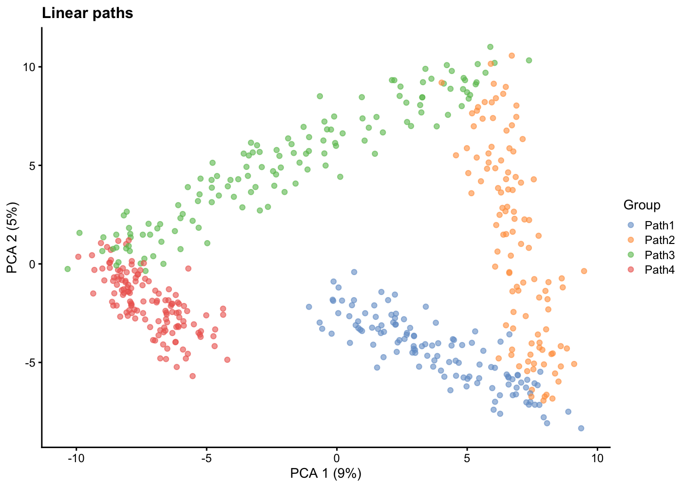
Batches
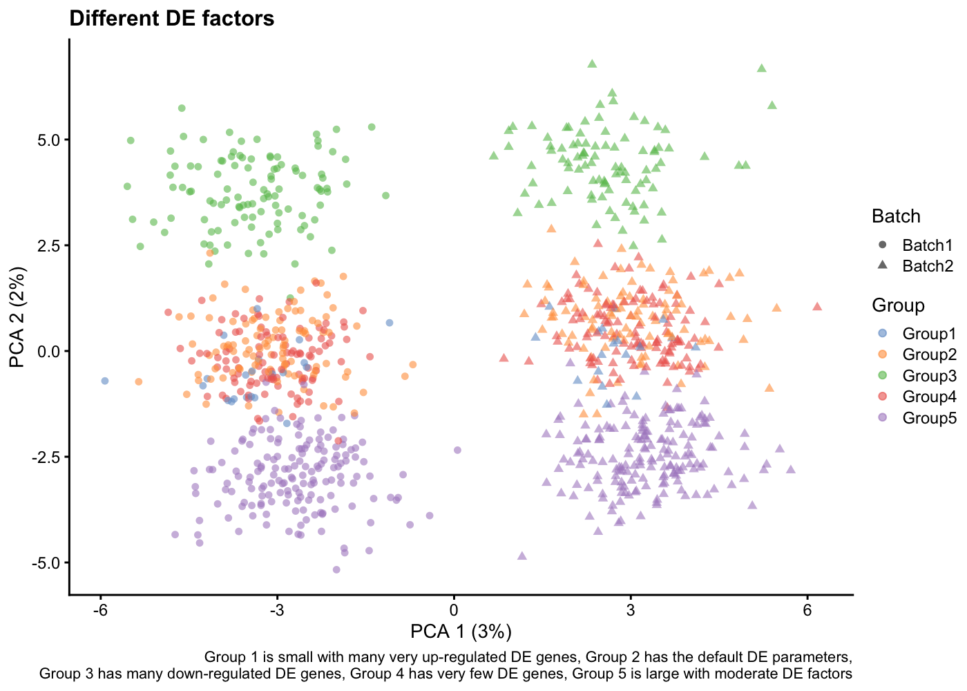
Finally, in some experiment, the number of cells is too high to be sequenced in one go. For these datasets you will have batch effects.
In splatter, If you give a vector of integers to the batchCells parameters, you will simulate batches.
sim <- splatSimulateGroups(params,
                            batchCells = c(500, 500),
                            nGenes = 1000,
                            group.prob = c(0.05, 0.2, 0.2, 0.2, 0.35),
                            de.prob = c(0.3, 0.1, 0.2, 0.01, 0.1),
                            de.downProb = c(0.1, 0.4, 0.9, 0.6, 0.5),
                            verbose = FALSE)
sim <- logNormCounts(sim)
sim <- runPCA(sim)
plotPCA(sim, colour_by = "Group", shape_by = "Batch") +
    labs(title = "Different DE factors",
         caption = paste(
             "Group 1 is small with many very up-regulated DE genes,",
             "Group 2 has the default DE parameters,\n",
             "Group 3 has many down-regulated DE genes,",
             "Group 4 has very few DE genes,",
             "Group 5 is large with moderate DE factors")
         )
Click on the Next link
